
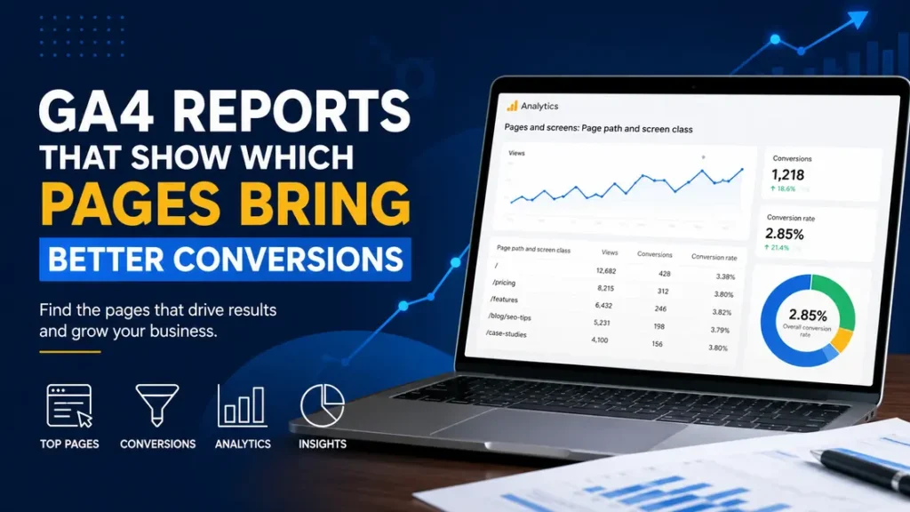
If you want to know which pages are doing real work on your site, the answer is in GA4 reports. The pages that bring better conversions are not always the pages with the most traffic, and that gap is where the useful insight lives.
A blog post with 50,000 visits can still be weak at driving leads. A much smaller page with 1,200 visits can bring 40 demo requests because the intent is stronger, the offer is clearer, or the page sits closer to the buyer’s decision.
Which GA4 reports show page-level conversions?
The fastest place to start is the Pages and screens report. It shows how each page performed for views, engagement, and key events, so you can compare a product page, a blog post, and a pricing page side by side.
Here is a simple example. A SaaS site might see these results in one month:
- Blog post: 18,400 views, 22 sign-ups
- Pricing page: 4,900 views, 180 sign-ups
- Case study page: 1,600 views, 64 sign-ups
The pricing page converts better than the blog post, even though it gets far less traffic. That is the kind of pattern you are looking for.
The Landing page report is just as useful, because it shows which entry pages start sessions that later lead to conversions. A page can be a good “first touch” page even if people do not convert on that page right away. Think of a how-to article that brings in 2,000 visitors a week and later feeds newsletter sign-ups or demo requests through other pages.
Also Read: Easy Tips to Make Your Website Faster and Easier to Use.
Why do some pages convert better than others?
Pages convert for different reasons. Some attract people who already know what they need. Others do a better job of answering questions, reducing doubt, or pointing to the next step.
A product comparison page usually converts better than a general industry article because the reader is closer to a decision. A visitor reading “Best Email Marketing Tools for Small Teams” is often far more ready to act than someone reading “What Is Email Marketing?”
There is also a page-design reason. A page with one clear CTA, two short paragraphs near the top, and a trust signal like a customer quote can outperform a page with five links, three popups, and no obvious next step. Small changes matter. A button label like “Start free trial” often beats “Submit” because it tells people what happens next.
How do you find converting pages in GA4?
This is where ga4 reports stop being theory and start being useful.
Use this workflow:
- Open Reports in GA4.
- Go to Engagement and then Pages and screens.
- Add or review the metric for Key events.
- Sort by key events, not just views.
- Compare high-conversion pages with high-traffic pages.
- Look for pages with a strong conversion rate and enough traffic to trust the result.
A real example helps. Suppose your blog has three pages:
- Page A: 12,000 views, 30 key events
- Page B: 3,000 views, 45 key events
- Page C: 900 views, 28 key events
Page B and Page C may matter more than Page A because they are pulling more action per visitor. Page A gets attention, but Page B may be doing a better job of pushing people toward a lead magnet, quote form, or signup.
Now check the Landing page report too. That report answers a different question: which first pages start journeys that end in conversion? A page with 8,000 landing-page sessions and only 14 direct form fills may still be valuable if it leads to assisted conversions later in the path.
Also Read: Content Promotion Services to Increase Brand Visibility.
What metrics matter most in GA4 reports?
Not every metric deserves equal weight. If you stare at views alone, you will miss the pages that actually move people.
These are the ones worth watching:
- Key events: This is the cleanest sign that a page helped produce a result.
- Engaged sessions: Good for spotting pages where people actually spend time.
- Average engagement time: Helpful, but do not treat longer as automatically better.
- Scroll depth: If a page has a CTA halfway down, scroll behavior matters a lot.
- Landing page sessions: Useful for understanding first-touch performance.
A product page with 2 minutes of average engagement time and 5% conversion rate is often stronger than a blog page with 6 minutes of engagement time and 0.2% conversion rate. People can spend time for the wrong reasons. Maybe they are confused. Maybe they are reading slowly. Maybe the page is hard to skim.
That is why context matters. A support article with low conversions may still be successful if its job is to reduce tickets, while a pricing page with high traffic but weak key events needs attention right away.
How do you compare pages the right way?
Do not compare raw totals only. Compare pages that serve the same purpose, or you will make the wrong call.
A few fair comparisons:
- Blog post vs. blog post
- Product page vs. product page
- Landing page vs. landing page
- Case study vs. case study
A single case study might get 700 visits and 31 demo requests. A blog post might get 9,000 visits and 12 demo requests. That does not mean the blog is “bad” and the case study is “good.” It may mean the blog brings colder traffic, while the case study catches people who are already closer to buying.
Also, watch for traffic source mix. A page that converts well from email traffic may not convert the same way from organic search. For example, a “pricing” page visited by 300 newsletter readers can easily beat the same page visited by 2,000 first-time search users.
Also Read: Website Maintenance and Performance Improvement Plans.
How do you read the story behind the numbers?
The numbers do not speak by themselves. You have to ask what the page is trying to do.
Here are three common situations:
- A page gets high traffic but weak conversions. That usually means the topic is broad, the CTA is weak, or the page attracts research-stage visitors.
- A page gets moderate traffic and strong conversions. That page is probably aligned with intent and should be protected or expanded.
- A page gets low traffic and strong conversions. That page may deserve more internal links, better title tags, or paid support.
Let’s say a plumbing company has a page about “water heater installation cost.” It gets 1,100 visits and 48 quote requests in a month. That page is probably doing better than a general “home maintenance tips” post with 14,000 visits and 3 quote requests. One page is selling. The other is just attracting readers.
That is the kind of detail people miss when they look at traffic alone.
What most people get wrong in GA4
The biggest mistake is treating every conversion as equal. A newsletter signup, a phone call, and a purchase can all sit under the same event setup if you are not careful, and that makes the data messy.
Another mistake is using too little data. If a page has 80 visits and 2 conversions, the rate looks great, but the sample is tiny. You should wait for a larger base, often at least a few hundred sessions, before treating the result as stable.
People also forget to check whether the page is the last click or one step in a longer path. A blog post might not convert on its own, but it may be the page that introduces the problem and gets the visitor back later through branded search or email. If you remove it because the direct rate looks weak, you may cut off a useful entry point.
One more thing: page titles can mislead you. A page called “5 SEO Tips” may convert well because it attracts agency leads, while a page called “SEO Services” may convert poorly because it feels too salesy. Names matter more than people admit.
Also Read: Paid Ad Management to Grow Targeted Website Leads Fast.
How can you use page data to improve conversions?
Once you spot the pages that perform best, use them as a model.
Start with these moves:
- Copy the CTA pattern from top pages to weaker pages.
- Put the strongest offer above the fold on pages with buyer intent.
- Add internal links from high-traffic pages to high-conversion pages.
- Trim distractions on pages meant to convert.
- Refresh headlines so they match the intent of the visitor.
A real scenario: an agency notices that one case study converts at 6.2% while three service pages sit below 1%. After reviewing the case study, they see a clear client quote, a short problem-solution format, and a CTA right after the results. They use the same structure on the service pages and lift leads without changing the offer itself.
That is the practical value of analytics reports. They show you what people respond to, not what you assume should work.
What should you check every month?
A monthly review is usually enough for most sites. Weekly checks can help on larger sites, but they also tempt you to react too fast.
Use this simple monthly checklist:
- Top 10 pages by key events
- Top 10 landing pages by conversion rate
- Pages with high views and low key events
- Pages with low views and high conversion rate
- Any page with a sudden drop of 20% or more
If a page loses 30% of its conversions month over month, do not guess. Check whether the page changed, whether the traffic source mix shifted, or whether the CTA broke. A form that stopped firing after a theme update has nothing to do with content quality, and GA4 will not warn you unless you look closely.
This is also where ga4 reports become part of a real workflow, not a one-time audit. The goal is not to admire charts. The goal is to find pages that deserve more traffic, better links, or a cleaner path to conversion.
Also Read: Responsive Website Builds Focused on Speed and SEO.
How do you turn one good page into a site-wide win?
Treat the best page like a pattern library. If one page converts at 4% and the rest sit near 1%, study the winning page line by line.
Look at:
- Headline style
- CTA placement
- Content length
- Proof points
- Internal links
- Mobile layout
For example, if a landing page with 1,300 visits and 52 sign-ups uses a short form, a single testimonial, and one clear CTA, those same pieces may help three weaker pages. You do not need to reinvent the page. You need to repeat what is already working.
That is the real payoff of smart page analysis. You are not just finding a winner. You are building a repeatable system.
Also Read: Local SEO Services to Boost Nearby Customer Traffic.
FAQ
Which GA4 report shows which pages convert best?
The Pages and screens report is the easiest place to start. Sort by key events so you can see which pages are tied to conversions, then compare that with views and engagement. A page with 2,000 visits and 40 key events is usually more valuable than a page with 20,000 visits and 30 key events.
Is the Landing page report better than Pages and screens?
They answer different questions. Pages and screens shows what happened on each page, while Landing page shows which first pages started sessions that led to results. For example, a blog post may not convert directly but can still be a strong landing page that feeds later conversions.
What is a good conversion rate for a page in GA4?
There is no single good rate. A pricing page, a case study, and a how-to article should not be judged by the same benchmark. A 3% conversion rate can be weak for a pricing page and strong for a blog post, depending on intent and traffic source.
Why do high-traffic pages sometimes convert poorly?
Because traffic quality matters more than traffic volume. A broad article may attract research-stage visitors who are not ready to act, while a smaller page may attract people close to buying. A page can get 15,000 visits and still underperform if the CTA does not match intent.
How many sessions do I need before I trust the data?
More is better, but a few hundred sessions is usually a safer place to start than a tiny sample. A page with 60 visits and 4 conversions can look amazing, yet that rate may swing hard next month. Wait for enough data to make the pattern stable.
Can GA4 show which pages assisted conversions?
Yes, but you need to look beyond one report. A page may start the journey, support research, or bring people back later through another channel. That is why comparing landing pages, assisted paths, and key events gives a fuller picture than checking one number.
Also Read: Technical SEO Fixes for Faster Site Indexing and Crawling.
Conclusion
The pages that matter most are the ones that turn attention into action. Find those pages, study what they do differently, and use that pattern across the rest of the site.
For more useful articles, visit my website: HighSoftware99.