We have all been there, sitting in front of a screen, staring at a spinning wheel that feels like it is mocking our patience. I remember one rainy Tuesday when I was trying to buy a last-minute gift. The site was beautiful, but it took forever to load each page. After thirty seconds of waiting, I simply closed the tab and went to a competitor. That moment was a wake-up call for me as a creator. It does not matter how great your content is if people cannot actually access it quickly or navigate it without a headache.
The digital world moves at a lightning pace, and users have become increasingly unforgiving when it comes to performance. If your website feels like it is running through mud, you are essentially closing your doors on potential friends, clients, or readers. We live in an era of instant gratification, where every millisecond counts toward building trust and authority. Improving your site is not just about technical jargon; it is about respecting your visitor’s time and making their journey as smooth as possible from the very first click to the final interaction.
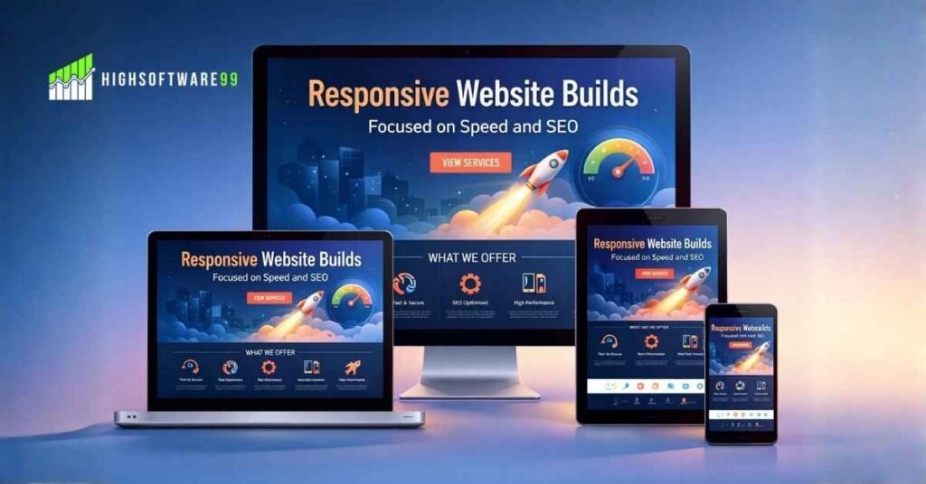
When I first started building websites, I thought that more features meant a better experience. I added sliders, high-resolution background videos, and every widget I could find. My site looked like a digital carnival, but it performed like a vintage car with a broken engine. I realized that simplicity and speed are the true kings of the internet. By focusing on the essentials, you create a space where users feel comfortable and empowered. Let’s dive into some practical, human-centered ways to make your digital home faster and much easier to navigate.
One of the biggest culprits of a sluggish website is unoptimized imagery. We all want our sites to look crisp and professional, but those massive five-megabyte photos from your DSLR are killing your load times. I once spent an entire weekend wondering why my homepage was so slow, only to find out that a single header image was larger than the rest of the page combined. It was a classic “facepalm” moment that taught me the importance of resizing and compressing every single file before it ever hits the server.
There are so many wonderful tools available today that can shrink your images without sacrificing quality. You do not need to be a professional editor to handle this. Using modern formats like WebP can significantly reduce file sizes while keeping things looking sharp. When you take the time to optimize your visuals, you are telling your visitors that you care about their data plans and their time. It is a small technical step that has a massive emotional impact on how people perceive your brand’s overall professionalism and reliability.
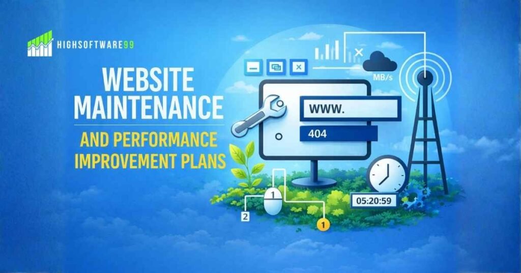
Beyond images, we need to talk about the “clutter” that accumulates in the backend of our sites. Think of it like a digital attic; over time, we install plugins, themes, and scripts that we eventually stop using. Each one of those elements adds a little bit of weight to your loading speed. I make it a habit to go through my dashboard once a month and delete anything that isn’t serving a vital purpose. It is incredibly cathartic to hit that “delete” button and watch your performance scores start to climb back up.
Browser caching is another magical element that often gets overlooked because it sounds too technical. In reality, it is just a way of telling a visitor’s computer to remember certain parts of your site so they don’t have to download them again on their next visit. Imagine if every time you went to a friend’s house, you had to ask where the kitchen was. Caching is like your friend saying, “You know where the snacks are; help yourself.” It builds a sense of familiarity and speed for returning users, making them feel right at home.
While speed is the engine, usability is the steering wheel. You can have the fastest car in the world, but if the driver cannot figure out how to turn, they are going to crash. Navigation should be intuitive and almost invisible. I always tell people to follow the “three-click rule.” If a user cannot find what they are looking for within three clicks, they are likely to get frustrated and leave. Keep your menus simple, use clear labels, and avoid trying to be too clever with your naming conventions.
I once visited a site where the “Contact” page was labeled “Let’s Have a Digital Coffee.” While the sentiment was sweet, I spent two minutes looking for it because I just wanted an email address. Clarity always beats cleverness in web design. You want your visitors to feel smart and capable, not confused. By using standard terms and predictable layouts, you reduce the cognitive load on your audience. This allows them to focus on your message rather than trying to solve a puzzle just to find your blog.
In the quest for a better user experience, looking at high-quality digital resources can make a world of difference. For those looking to stay ahead of the curve in tech and web trends, checking out Voomixi can provide the inspiration needed to refine your online presence. Staying informed about the latest tools and strategies ensures that you are not just building for today, but also preparing for the future of the web. It is all about finding that perfect balance between modern aesthetics and functional, high-speed performance.
Mobile responsiveness is no longer an “extra” feature; it is a fundamental requirement. More than half of all web traffic comes from mobile devices, yet I still see sites that look like they were designed for a giant desktop monitor in 2005. I remember trying to read a blog on my phone while waiting for a bus, and I had to pinch and zoom just to see the text. It was so frustrating that I gave up. Don’t be that person. Your site needs to be a “chameleon,” shifting its shape perfectly to fit any screen size.
When you design with a mobile-first mindset, you naturally prioritize the most important content. You learn to cut out the fluff because there simply isn’t room for it on a five-inch screen. This discipline actually makes your desktop site better, too. It forces you to think about hierarchy and what truly matters to your reader. Testing your site on different phones and tablets is a great way to see your work through the eyes of your audience. If it feels clunky on a phone, it needs more work.
Let’s talk about white space, or as I like to call it, “the room to breathe.” Many people are afraid of empty space on a website and feel the need to fill every corner with ads, text, or images. However, white space is actually a powerful tool that guides the user’s eye to what is important. It prevents sensory overload and makes your content much easier to digest. Think of a well-organized museum versus a cluttered thrift store; which one allows you to appreciate the art more? Give your content some space.
Readability is another huge factor in making a site easier to use. I have seen beautiful websites ruined by tiny fonts or low-contrast colors that made my eyes ache. Your text should be large enough to read without squinting, and there should be a strong contrast between the font and the background. I personally love a classic dark text on a light background because it is the most accessible for everyone. Remember, your goal is to communicate, and you cannot do that if your text is illegible or physically tiring to read.
Broken links are the digital equivalent of a “Keep Out” sign. There is nothing more disappointing than clicking on a promising headline only to land on a 404 error page. It breaks the trust you have worked so hard to build. I use automated tools to scan my site for dead links every few weeks. It is a small maintenance task that prevents a lot of user frustration. If you do have a 404 page, make it friendly and helpful, providing a way for the user to get back on track.
Consistency is the glue that holds a great user experience together. Your buttons, colors, and font styles should remain the same across every page. This creates a sense of stability and helps users understand how to interact with your site. If your “Buy Now” button is blue on one page and green on another, it creates a split second of hesitation. In the world of web design, hesitation is the enemy of conversion. You want every interaction to feel like a natural progression of the last one.
Search functionality is often the unsung hero of a user-friendly website. For sites with a lot of content, a prominent and accurate search bar is a lifesaver. I often know exactly what I am looking for when I visit a site, and I don’t want to dig through categories to find it. Providing a powerful search tool shows that you understand your user’s needs and want to help them find answers as quickly as possible. It is a feature that saves time and boosts satisfaction significantly.
As you continue to grow and expand your digital footprint, it is vital to keep learning from experts in the field. Websites like Voomixi offer a wealth of information that can help you navigate the complexities of the digital landscape. Whether you are looking for tips on SEO or the latest in software development, having a go-to source for reliable information can save you hours of trial and error. Investing time in your own education is the best way to ensure your website remains a top-tier destination for your target audience.
Security is a component of usability that we often forget until something goes wrong. A site that triggers a “Not Secure” warning in a browser is a site that people will flee from instantly. Having an SSL certificate is non-negotiable in today’s world. It is not just about protecting data; it is about providing peace of mind. When a user sees that little padlock icon in their browser, they feel safe engaging with your content. That feeling of safety is the foundation of any long-term relationship you hope to build online.
Feedback is the final piece of the puzzle. Sometimes, we are too close to our own projects to see the obvious flaws. I regularly ask friends or even strangers to try and perform a specific task on my site while I watch. Seeing where they stumble is incredibly eye-opening. You might find that a button is too small or that a form is too confusing. Listening to real people is the most effective way to humanize your site and ensure that it is actually serving the needs of your community.
In conclusion, making your website faster and easier to use is an ongoing journey, not a one-time destination. It requires a mix of technical adjustments and a deep sense of empathy for your visitors. By focusing on speed, clarity, and mobile-friendliness, you create a digital space that people actually want to spend time in. It is about removing the barriers between your ideas and your audience. When you prioritize the human experience, the results—whether they are higher traffic, more sales, or better engagement—will naturally follow.
Take it one step at a time. You don’t have to fix everything overnight. Start by optimizing your images, then move on to cleaning up your plugins, and eventually, look at your overall design hierarchy. Every small improvement you make adds up to a significantly better experience for the people who matter most: your users. Your website is a living, breathing entity, and with a little bit of care and attention, it can become a powerful tool that connects you with the world in the most efficient and friendly way possible.
For more useful articles, visit my website: HighSoftware99.