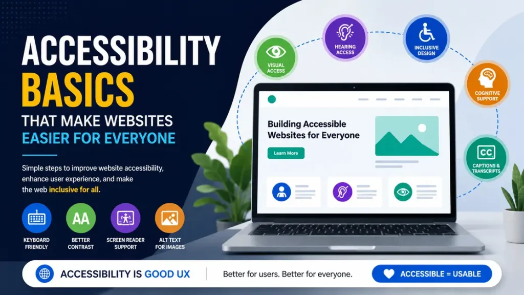
Website accessibility means building a site people can actually use, no matter how they browse. A page with clear headings, readable text, and keyboard access helps someone with low vision, a broken mouse, or tired hands finish the task without getting stuck.
Here’s the thing: most accessibility problems are not fancy technical problems. They are small design choices that make a simple job harder than it should be.
What does website accessibility mean in practice?
At its core, website accessibility is about removing barriers. If a visitor can find the menu, read the text, fill out a form, and click the right button without guessing, the site is doing a lot of the work right.
A few everyday examples make this easier to picture:
- A shopper on a laptop can move through a checkout form with the Tab key because every field has a proper label.
- A person using a screen reader hears “Email address” instead of “blank field.”
- Someone on a phone in bright sunlight can still read the text because the contrast is strong enough.
- A visitor with one hand free can tap the main buttons without hunting around for tiny controls.
That is the practical side of website accessibility. It is not a special feature for a small group. It is part of a good user experience.
Why does website accessibility matter so much?
A site that is hard to use loses people fast. A homepage that looks fine to you can still be frustrating if the navigation only works with a mouse or if the form labels disappear after the user starts typing.
Think about a common case: a customer is trying to book an appointment during a short break. They are on a phone, the battery is low, and the screen is cracked in one corner. That person does not need a flashy interface. They need a page that works on the first try.
This is where many teams get it wrong. They treat accessibility as a separate project, then push it to the end. That usually means it gets fixed after launch, when the cost is higher and the damage is already done.
There is also a business side to this. Better usability lowers support requests, reduces abandoned forms, and makes content easier to scan. A cleaner experience often helps everyone, not just people who need assistive tech.
Also Read: Easy Tips to Make Your Website Faster and Easier to Use.
What are the website accessibility basics that fix most problems?
Most of the heavy lifting comes from a short list of habits. You do not need to rebuild a site from scratch to make a real difference.
1) Use clear headings in the right order
Headings help people scan a page. They also help screen reader users understand the page structure.
A good page usually has one main H1, then H2s for major sections, then H3s for subpoints. If a page jumps from H1 to H4 for styling reasons, the structure becomes messy fast.
For example, a blog post about spring cleaning could use:
- H1: How to Clean a Car Interior
- H2: What tools you need
- H2: How to clean seats
- H3: How to clean cloth seats
- H3: How to clean leather seats
That structure is easier to follow than a page full of bold text pretending to be headings.
2) Make text easy to read
Readable text is not just about font choice. It is about line height, paragraph length, and contrast.
A paragraph with 35 to 60 words is much easier to read than a giant block that runs for 150 words. On mobile, long lines and cramped spacing make people lose their place.
A practical example: if your body text is light gray on a white background, it may look stylish on a design mockup and fail in the real world. A strong contrast ratio, such as the WCAG AA target of 4.5:1 for normal text, gives users a much better chance of reading the page comfortably.
3) Keep color from carrying the whole message
Color can help. It should not be the only way to communicate something.
For example, a form error that says only “red means wrong” is not enough. A better version says “Phone number is required” and also highlights the field. That way, the message still makes sense to someone who cannot see the color clearly.
The same idea applies to charts and status labels. If green means “approved” and red means “rejected,” add text too. A small label saves a lot of confusion.
4) Make every important action work with a keyboard
This is one of the fastest checks you can do.
Put your mouse aside and press Tab. Can you reach the menu, buttons, form fields, and close icons in a sensible order? Can you see where focus is moving? Can you open and close dropdowns without the mouse?
If not, the page needs work.
A common example is a popup newsletter form. It may look fine, but if the close button cannot be reached with a keyboard, the user is trapped. That is not a minor bug. It breaks the page.
5) Write alt text that explains the image
Alt text should tell the user what matters about the image. It should not sound like a file name.
For a product photo of a blue office chair, “Blue mesh office chair with adjustable arms and wheels” works well. “Chair image 2” does not.
If the image is decorative, it may not need alt text at all. But if it shows useful information, like a chart, product feature, or step in a tutorial, the text needs to say something real. A screenshot of a settings menu, for example, should mention the exact menu path if the image is meant to guide the user.
6) Label forms so nobody has to guess
Forms are where bad usability gets expensive.
A field that shows only placeholder text such as “Enter email” can create problems once the user starts typing. The label disappears, and the person has to guess what the field was for. That gets worse on longer forms with five or six fields.
A cleaner approach is simple:
- Name fields clearly.
- Add error messages near the field.
- Explain format expectations.
- Keep instructions short.
For example, “Phone number” is better than “Contact info.” “MM/DD/YYYY” is better than leaving the date field vague. A checkout form with clear labels can save minutes and reduce mistakes.
7) Use link text that says where the link goes
“Click here” is weak. “Read the shipping policy” gives the user a real clue.
This matters more than most teams think. Screen reader users often jump through links on a page to get the lay of the land. If six links all say “Learn more,” the page becomes a guessing game.
A simple fix is to make the link text specific. “Download the 2025 pricing sheet” is much better than “Download.” It works for everyone, and it takes almost no extra effort.
8) Add captions or transcripts to video
If a video contains spoken instructions, captions help people follow along in noisy places, quiet offices, and shared spaces. They also help users who process written text better than audio.
A two-minute tutorial without captions can leave people stuck. A captioned version gives them a second way to follow the same information. For recorded webinars, a transcript is useful too. It turns a single video into searchable text.
Also Read: Website Maintenance and Performance Improvement Plans.
How can you test a page in 15 minutes?
You do not need a giant audit to spot obvious issues. A short manual check catches a surprising amount.
Use this quick test:
- Open the page and zoom to 200%.
- Press Tab through the page.
- Try the form with just the keyboard.
- Look for text that disappears against the background.
- Check the page on a phone-sized screen.
- Read the image captions and alt text aloud to yourself.
If a button moves off screen at 200% zoom, that is a real problem. If you cannot tell which field is active, that is another one. These checks take about 15 minutes on a normal page and reveal more than most people expect.
A small content site with 10 pages can often be improved in a day. A store with 200 product pages takes longer, but the same test still finds the weak spots.
What do teams get wrong with accessible design?
The biggest mistake is treating accessible design like a plugin. A widget on the corner of the page can help with a few things, but it does not fix broken form labels, poor heading structure, or unusable modals.
Another common mistake is designing only for desktop. A page that looks polished on a 27-inch monitor can become cramped and awkward on a phone. If the menu needs perfect mouse control or the buttons are too close together, mobile users feel it fast.
Teams also overcomplicate the work. They spend weeks arguing about a redesign and never fix the basics. In practice, the first wins are usually boring:
- stronger contrast,
- clearer buttons,
- better labels,
- better headings,
- and keyboard support.
That is where accessible design starts paying off.
What should you fix first on a live site?
If you are working on an existing site, start with the pages that get the most traffic or handle money. For many businesses, that means the homepage, product pages, contact form, and checkout.
Here is a practical priority list:
| Priority | What to fix | Why it matters |
|---|---|---|
| 1 | Navigation and headings | Helps users orient themselves fast |
| 2 | Forms and error messages | Affects signups, leads, and purchases |
| 3 | Contrast and text size | Makes content readable on every screen |
| 4 | Keyboard access | Catches major usability gaps |
| 5 | Images and media labels | Helps screen reader users and search visibility |
If you only have one afternoon, start with the form on the page that matters most. A contact form with poor labels can block real leads. A checkout form with weak error handling can cost sales the same day.
For a small business site, that first round of fixes can be enough to remove the worst friction. For a larger site, it becomes the base for a stronger content and UX process.
How does website accessibility connect to better UX?
They are closely linked. Good accessibility habits usually make the whole experience cleaner.
Clear labels help everyone. Strong contrast helps everyone. Logical headings help everyone. A keyboard-friendly page helps everyone. That is why website accessibility and UX basics tend to improve together.
A helpful example is a course signup page. If the page has a short form, a clear headline, a visible submit button, and an error message that says exactly what is wrong, people move through it faster. That same structure also helps someone using assistive technology. One good choice serves both groups.
Also Read: Responsive Website Builds Focused on Speed and SEO.
What does a realistic improvement plan look like?
You do not need a huge roadmap to start. A simple 4-step plan works for many sites:
- Fix the top 5 pages that get the most traffic.
- Clean up headings, labels, and button text.
- Test keyboard access and mobile view.
- Review images, video captions, and error messages.
A small team can often finish the first pass in one week. A larger site may need a few sprints, especially if templates are shared across many pages. The key is to keep moving on the basics instead of waiting for a perfect redesign.
And yes, it is worth checking again after changes go live. A form that works in staging can break after a CMS update or a theme change.
FAQ
What is website accessibility in simple terms?
Website accessibility means people can use a site without unnecessary barriers. That includes users with screen readers, keyboard-only navigation, low vision, temporary injuries, or slow connections. A page with clear text, labels, and working controls is a good example.
What are the first things to fix on a website?
Start with headings, form labels, color contrast, keyboard access, and link text. These changes solve a lot of common problems fast. For example, a checkout form with clear labels and visible errors is easier for everyone to finish.
How do I test website accessibility quickly?
Use a keyboard, zoom the page to 200%, and check the site on a phone screen. Then look at headings, image alt text, and form errors. A 15-minute manual check can reveal issues that tools miss.
Does accessibility help SEO?
Yes, often in indirect ways. Clear structure, better headings, descriptive links, and cleaner content usually make pages easier to crawl and easier to read. A page that works better for people often ends up working better for search too.
Is an accessibility widget enough?
No. A widget may help with a few settings, but it does not fix a broken form, weak heading structure, or keyboard traps. Real website accessibility comes from the page itself, not a small add-on in the corner.
Also Read: Plugin Conflict Fixes Without Breaking Your WordPress Site.
Final takeaway
Start with the basics, fix the pages people use most, and test them with a keyboard and a phone. That is the fastest way to make a site easier for everyone.
For more useful articles, visit my website: HighSoftware99.