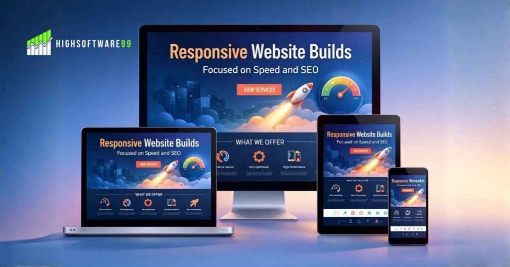
You know that moment when you pull out your phone to check a site, and it takes forever to load or looks all messed up? Your finger hovers over the back button before the page even finishes. That frustration costs businesses real money every single day. I have seen it happen with owners who thought their old site was fine until traffic from phones dried up and sales followed. At HighSoftware99 we fix exactly that problem by creating responsive website builds that load fast and rank well in search results.
A responsive website changes its layout automatically so it works perfectly on phones, tablets, or desktops. No zooming, no sideways scrolling, just clean content that feels made for the device you use. We focus on speed and SEO from the first line of code because those two elements decide whether visitors stay or leave and whether Google sends you traffic or buries you on page three.
Let me walk you through why this matters and how we build responsive websites that actually deliver results for real businesses.
Why a Responsive Website Matters for Every Business Today
Over sixty percent of all website visits now come from mobile devices. Recent data puts the number right around that mark, with phones handling the majority of browsing worldwide. People shop, read, and compare options on their phones while waiting in line or riding the bus. If your site does not adapt, you lose those visitors before they even see what you offer.
A responsive website solves that by using flexible grids and media queries in the code. Images resize, text reflows, buttons stay easy to tap. One set of files works everywhere instead of separate mobile and desktop versions that double your maintenance work and confuse search engines.
I remember a small clothing store owner who contacted us after noticing orders had dropped sharply. His old site looked great on his laptop but turned into a jumbled mess on phones. Customers told him they gave up trying to add items to the cart. We rebuilt it as a responsive website and traffic from mobile jumped within weeks. Sales followed because people could actually browse and buy without fighting the layout.
That story repeats with local shops, service providers, and even bigger companies. A responsive website removes barriers so your message reaches everyone no matter the screen size. Google noticed this shift years ago and now uses mobile versions as the main reference for ranking through mobile-first indexing.
Also Read: SEO by HighSoftware99.com: Strong Easy Steps to Rank Higher.
Speed Becomes the Make-or-Break Factor in Every Responsive Website
Fast loading times separate good responsive websites from ones people abandon. Google measures three key signals called Core Web Vitals: how quickly the main content appears, how stable the page stays while loading, and how fast it responds to taps. Sites that hit good scores on these metrics keep visitors longer and rank higher when everything else stays equal.
We start every responsive website project by setting strict targets. Largest contentful paint under two and a half seconds. Interaction to next paint under two hundred milliseconds. Cumulative layout shift below point one. These numbers come straight from what Google rewards.
How do we hit them? We compress every image without losing quality. We minify CSS and JavaScript files so the browser downloads less data. We set up caching so returning visitors load pages almost instantly. We choose fast hosting and enable compression on the server side. Every choice stacks together to shave seconds off load times.
One restaurant client came to us frustrated because their menu page took seven seconds on mobile. Diners left before seeing the specials. We rebuilt it as a responsive website with optimized images and smart caching. Load time dropped to one point eight seconds. Reservations increased because people stayed long enough to read and click.
Slow sites hurt more than just user patience. Bounce rates climb and Google takes that as a signal the page fails to satisfy searchers. A responsive website built with speed in mind sends the opposite message: this site works well and deserves higher placement.
How SEO and Responsive Website Design Work Together
Search engines crawl and index your site based on the mobile version first. A responsive website design gives Google one clean URL and one set of content to evaluate instead of separate versions that create duplicate problems. That single codebase makes technical SEO simpler and more powerful.
We handle the details that matter for rankings. Proper viewport meta tags so the browser knows the page scales correctly. Structured data markup that helps rich results appear in search. Clean internal links that work on any device. All these elements live inside the responsive website we build.
Keyword placement stays natural because content adapts without breaking the flow. Headings adjust size but keep their hierarchy. Alt text on images describes content accurately for both users and search bots.
A service business owner shared how his old non-responsive site ranked for a few terms but never climbed higher. After our responsive website design services went live, pages started moving up because Google could crawl everything efficiently and users stayed engaged. Organic traffic grew steadily month after month without extra ad spend.
Custom website design by HighSoftware99 always ties these SEO elements directly into the responsive structure. We run full audits before coding begins so we fix crawl errors, broken links, and speed issues upfront instead of patching them later.
Also Read: SEO Instant Appear HighSoftware99.com: Grow Traffic Now.
The Custom Website Design by HighSoftware99 Process Step by Step
Every project starts with a conversation about your goals. We look at your current traffic numbers, bounce rates, and top pages. Then we create an action plan that lists exactly what we will change and when.
Next comes the design phase. We sketch layouts that feel natural on phones first, then expand them to larger screens. Colors, fonts, and images stay consistent while the structure flexes. Clients review mockups on their own devices so they see the responsive website exactly as customers will.
Development follows with clean code that loads fast. We add custom features like contact forms, booking calendars, or product filters that work smoothly across devices. Testing happens on real phones, tablets, and desktops plus tools that simulate slower connections.
Once live we monitor performance with analytics and search console data. Adjustments continue as needed so the responsive website keeps its speed edge even when content grows. Maintenance packages keep security updates and speed tweaks current without you lifting a finger.
This full cycle turns a basic site into a responsive website that serves as a reliable sales tool. Responsive website design services from HighSoftware99 include all these steps so you get one partner handling design, speed, and SEO together.
Also Read: On-Page SEO Optimization to Improve Search Rankings Now.
Common Problems We Fix in Responsive Website Builds
Many businesses start with sites built years ago when mobile traffic barely registered. Those projects often use fixed widths that break on modern phones. Or they rely on separate mobile subdomains that split SEO authority.
Images stay huge because nobody optimized them for web use. Code contains unused scripts that slow everything down. Navigation menus hide important links on small screens.
We spot these issues during the audit and correct them systematically. A responsive website we build avoids all those pitfalls because we code for flexibility from day one. The result feels effortless for users and efficient for search engines.
Another frequent pain point involves slow hosting or missing caching. Even a perfectly coded responsive website drags if the server responds late. We recommend and set up the right environment so performance stays consistent worldwide.
Real Results from Responsive Website Projects
Take the local retailer example again. After launch his mobile conversion rate tripled. Customers now browse categories easily and complete purchases in fewer taps. Rankings improved for local search terms because the site loaded quickly and matched what people sought on phones.
A consultant we helped saw similar gains. His service pages ranked higher once the responsive website design removed friction. Leads increased because visitors could read case studies comfortably on their phones during lunch breaks.
These stories come from ordinary businesses that simply needed a responsive website built the right way. Speed and SEO focus turned average sites into assets that generate steady growth.
We track everything and share reports that show traffic sources, load times, and ranking changes. You see the numbers improve month after month instead of guessing whether changes worked.
Also Read: Technical SEO Fixes for Faster Site Indexing and Crawling.
Getting Started with Your Own Responsive Website
The process feels straightforward when you work with the right team. You reach out through the site and we schedule a quick call to learn about your business. No pressure, just honest talk about what you need.
From there we run the audit and present clear options. You choose the plan that fits your budget and timeline. Many clients start small with a redesign of key pages and expand later as results appear.
Custom website design by HighSoftware99 adapts to different industries. E-commerce stores get fast product grids. Service sites receive clear call-to-action buttons. Blogs focus on readable text that flows across screens.
Throughout the project you stay involved with previews and feedback rounds. The final responsive website belongs to you completely with full access to code and files.
Also Read: Local SEO Services to Boost Nearby Customer Traffic.
Keeping Your Responsive Website Strong Over Time
Launch day marks the beginning, not the end. Content changes, new products arrive, and technology moves forward. We offer ongoing support that includes speed checks, security updates, and occasional layout tweaks to match new devices.
Regular reports highlight what works and what needs attention. You never wonder whether your responsive website still performs well because data tells the story.
Many clients tell us the peace of mind alone makes the partnership worthwhile. They focus on their actual business while we handle the technical side that keeps the responsive website fast and visible in search.
If you feel ready to move past a site that holds you back, consider what a properly built responsive website could do for your traffic and sales. HighSoftware99 specializes in responsive website design services that put speed and SEO at the center so your business gains an edge that lasts.
Contact us today and let us show you the difference a responsive website built for real users and real search results can make. Your visitors deserve an experience that works the first time every time, and your business deserves the growth that follows.